

Top Typography Trends in Packaging Design
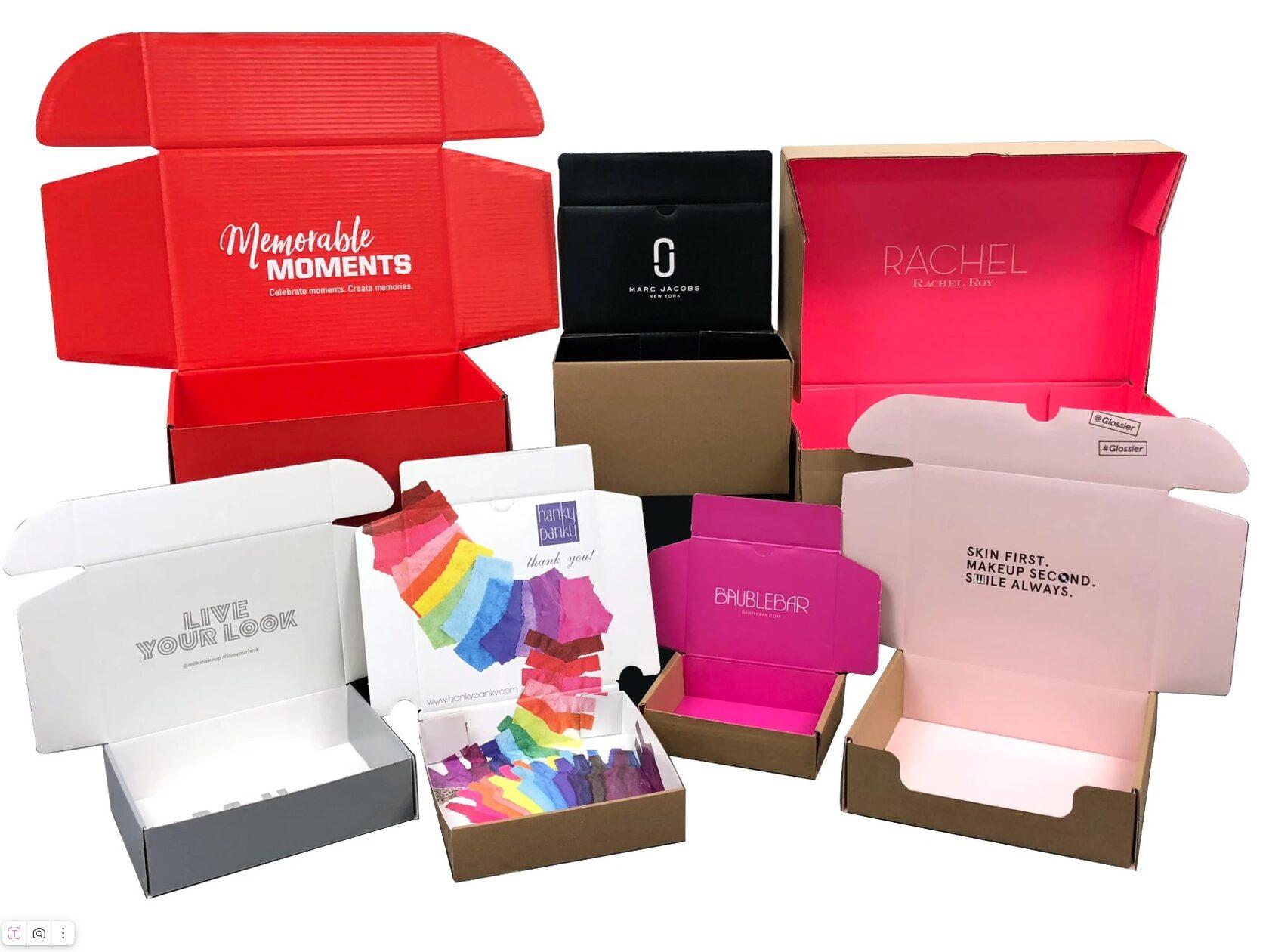
Typography plays a major role in modern packaging design. It shapes how people see a product and remember a brand. Today, businesses focus on fonts that create emotion, trust, and strong shelf appeal.
Packaging design trends continue to evolve with consumer behavior. As a result, typography has become more creative, clean, and experience-driven across many industries.
Minimal Fonts with Strong Visual Impact
Minimal typography remains one of the strongest trends in packaging design. Brands now prefer clean fonts with simple letterforms because they improve readability and create a modern appearance. This style works well for food, skincare, fashion, and wellness products.
Simple typography gives packaging a premium look. It removes visual clutter and helps buyers focus on the product itself. Moreover, clean spacing between letters creates balance and elegance. Many companies also use bold sans-serif fonts because they look fresh and professional.
Minimal fonts support modern shopping habits. Consumers often make fast buying decisions. Therefore, packaging must communicate quickly. Clear typography helps customers understand product details without confusion.
This trend also supports digital marketing. Many products appear online before reaching stores. Minimal typography looks attractive on mobile screens and social media posts. Consequently, brands maintain visual consistency across online and offline platforms.
Designers often combine neutral colors with clean fonts to strengthen the visual message. Black, white, beige, and soft earthy tones remain popular choices. These combinations create calm and trustworthy packaging.
Another reason behind this trend is sustainability. Eco-friendly brands prefer simple typography because it matches natural and responsible branding. The overall design feels authentic rather than overly promotional.
Minimal typography proves that less can often achieve more. It helps products appear refined, modern, and easy to recognize in crowded retail environments.
Bold Retro Typography Making a Comeback
Retro typography has returned strongly in modern packaging design. Many brands now use vintage-inspired fonts to create emotional connections with buyers. This trend combines nostalgia with modern creativity.
Old-style lettering creates warmth and familiarity. People often trust products that remind them of past experiences. As a result, retro typography works especially well for beverages, snacks, cosmetics, and handmade products.
Several visual elements define this trend:
- Thick vintage fonts with rounded edges
- Hand-drawn lettering styles
- Classic color palettes from past decades
- Layered text layouts with decorative details
- Distressed textures for an aged appearance
These typography styles make products feel unique and memorable. They also help smaller businesses stand out against larger competitors. Consumers often appreciate packaging that feels personal and artistic.
Modern designers do not fully copy old packaging styles. Instead, they blend retro typography with cleaner layouts and updated branding. This balance keeps the design fresh while maintaining nostalgic charm.
Retro fonts also perform well on social media. Their bold appearance attracts attention quickly in digital spaces. Therefore, many brands use this style to increase visual engagement online.
In addition, retro typography supports storytelling. It allows brands to highlight heritage, craftsmanship, or tradition through design alone. Customers often connect emotionally with products that feel authentic and timeless.
This trend shows how typography can influence emotions. Vintage-inspired lettering adds personality and depth while helping products create lasting impressions in competitive markets.
Handwritten Fonts Creating Human Connection
Handwritten typography continues to grow in packaging design because it feels natural and personal. Consumers now prefer brands that appear honest and approachable. Handwritten fonts help create that emotional connection.
This style adds warmth to packaging. Unlike rigid digital fonts, handwritten lettering feels expressive and human. Consequently, it works well for organic foods, bakery products, candles, skincare, and artisan goods.
Many brands use handwritten typography to highlight creativity and authenticity. The design often feels handcrafted rather than mass-produced. This perception increases customer trust and emotional attachment.
Designers also use handwritten fonts to create visual movement. Curved strokes and flowing letters guide the eyes naturally across packaging. As a result, products become more engaging on store shelves.
However, readability remains important. Modern packaging combines handwritten elements with simpler supporting fonts. This balance keeps the design attractive while ensuring clear communication.
Handwritten typography also supports storytelling. It can reflect the personality behind a product or the values of a company. Many small businesses use this style to create stronger customer relationships.
In some cases, brands print signature-style typography directly onto labels. This approach gives packaging a premium and exclusive feel. Customers often associate such details with care and craftsmanship.
The rise of personalized branding has also strengthened this trend. Businesses want packaging that feels emotional rather than corporate. Therefore, handwritten typography continues to shape modern visual identity across many industries.
Large Typography Dominating Packaging Layouts
Large typography has become a powerful visual trend in packaging design. Many brands now place oversized text at the center of packaging to attract attention instantly.
This approach improves visibility in busy retail spaces. Consumers often scan shelves quickly. Therefore, large typography helps products stand out within seconds.
Designers use bold typefaces with strong spacing to create confidence and clarity. In many cases, the product name becomes the main visual element. This method reduces unnecessary graphics and keeps the design focused.
Large typography also supports modern branding strategies. It communicates transparency and simplicity. Customers can easily identify products without searching for important information.
Several benefits make this trend highly effective:
- Strong shelf visibility in crowded stores
- Faster product recognition
- Improved readability for all age groups
- Modern and confident brand appearance
- Better visual impact in online product photos
Brands also experiment with creative text placement. Some designs use vertical typography, while others stretch letters across the entire package. These techniques add uniqueness without making the design confusing.
Color contrast plays an important role as well. Bold typography often appears with simple backgrounds to maximize readability. Black text on soft neutral colors remains especially popular.
Large typography works across both luxury and affordable product categories. Whether used on beverages or beauty products, it creates strong visual communication.
This trend reflects a larger shift toward direct and honest branding. Clear messaging and bold typography now help products build immediate consumer trust.
Experimental Typography with Artistic Expression
Experimental typography is changing how packaging communicates with consumers. Designers now treat typography as visual art instead of using it only for reading information.
This trend encourages creativity and originality. Brands use distorted letters, layered text, unusual spacing, and abstract arrangements to create memorable packaging. As a result, products appear more innovative and modern.
Experimental typography often targets younger audiences. Many consumers enjoy bold and unconventional visuals that feel fresh and exciting. Therefore, this style appears frequently in fashion, energy drinks, gaming products, and streetwear brands.
Creative typography also helps brands develop unique identities. Standard fonts can sometimes feel repetitive. Experimental layouts allow businesses to express personality and artistic direction more clearly.
Despite its artistic nature, successful experimental typography still maintains readability. Designers carefully balance creativity with communication. The goal is to create visual excitement without confusing customers.
Technology has also influenced this trend. Advanced design software allows creators to manipulate typography in new ways. Motion-inspired layouts and 3D text effects are now common in modern packaging concepts.
In addition, social media culture encourages visually striking packaging. Unique typography often attracts online attention and increases product sharing. Consumers enjoy photographing packaging that feels creative and different.
Some brands even combine experimental typography with sustainable materials and Custom Boxes to create stronger visual impact and premium customer experiences.
This trend highlights the growing role of typography as both communication and artistic storytelling within modern packaging design.
Serif Fonts Returning to Luxury Branding
Serif typography has returned strongly in premium packaging design. Many luxury brands now use elegant serif fonts to communicate sophistication and trust.
These fonts contain small decorative strokes that create a timeless appearance. They often feel refined and classic. Therefore, serif typography works especially well for perfumes, jewelry, wine, and high-end skincare products.
Luxury packaging relies heavily on emotional perception. Serif fonts naturally create feelings of heritage and quality. Consumers often associate them with tradition and craftsmanship.
Modern designers now combine serif typography with minimal layouts. This approach prevents packaging from looking outdated. Instead, the design feels balanced, elegant, and contemporary.
Thin serif fonts are especially popular because they create softness and visual sophistication. Gold foil printing and embossed text further enhance this premium effect.
Serif typography also improves storytelling. It allows brands to communicate history, exclusivity, and authenticity through subtle visual details. Customers often view such packaging as more valuable.
Many luxury companies also pair serif fonts with soft neutral colors and textured materials. Together, these elements create a polished customer experience from first glance to final purchase.
The rise of premium branding in competitive markets has increased demand for sophisticated typography. Businesses want packaging that feels memorable and emotionally appealing.
This trend proves that classic typography styles still hold strong influence in modern packaging design when combined with updated visual strategies.
Sustainable Typography with Natural Design Elements
Sustainability now shapes many typography choices in packaging design. Eco-conscious brands prefer fonts that reflect simplicity, honesty, and environmental responsibility.
Natural typography often includes earthy textures, soft edges, and organic spacing. These visual choices create a calm and authentic appearance. As a result, consumers immediately associate the product with sustainability.
Many eco-friendly brands avoid overly decorative typography. Instead, they focus on readability and balance. Simple fonts printed on recycled materials create stronger visual trust.
Designers also use muted colors to support sustainable branding. Green, brown, cream, and soft gray tones work especially well with natural typography styles.
This trend reflects changing consumer values. Modern buyers often support brands that demonstrate environmental awareness. Therefore, packaging design now communicates sustainability visually as well as verbally.
Handcrafted typography also appears frequently in eco-friendly packaging. It reinforces the idea of natural production and responsible sourcing. Customers often view such packaging as more genuine and ethical.
In addition, sustainable typography supports minimalist printing methods. Using fewer inks and simpler designs reduces environmental impact during production.
Many businesses now understand that typography influences brand perception deeply. Even small font choices can communicate responsibility, quality, and transparency.
As sustainability continues growing worldwide, natural typography will likely remain a major direction in future packaging design trends.
Digital-Inspired Typography for Modern Consumers
Digital-inspired typography has become highly popular in modern packaging. Brands now use futuristic fonts and tech-based layouts to attract younger and digitally connected consumers.
This trend often features geometric fonts, sharp lines, and sleek spacing. The overall appearance feels clean, innovative, and forward-thinking. Technology brands, fitness products, and electronic accessories commonly use this typography style.
Digital typography reflects modern lifestyles. Consumers spend large amounts of time online, so brands create packaging that feels compatible with digital culture. Consequently, typography now mirrors app interfaces and modern screen aesthetics.
Bright color contrasts also support this trend. Neon shades, metallic finishes, and dark backgrounds create futuristic visual appeal. These combinations help products stand out strongly in retail spaces.
Motion-inspired typography is another growing element. Some designs use layered text and dynamic positioning to create a sense of speed and energy. This style feels highly modern and visually engaging.
Digital-inspired typography also performs well in online marketing. Products often appear sharper and more recognizable in digital advertisements and social media campaigns.
Brands use this trend to communicate innovation and efficiency. Customers often associate futuristic typography with advanced technology and modern quality standards.
As digital culture continues expanding, typography will likely become even more interactive and visually experimental within future packaging design strategies.
Final Thoughts
Typography has become one of the strongest tools in modern packaging design. It does much more than show product information. It builds emotion, trust, and brand identity in a very short time. As markets become more competitive, brands now depend on typography to communicate clearly and quickly.
Today’s trends show a clear shift toward balance. Minimal fonts improve clarity, while bold and experimental styles add personality. At the same time, retro and handwritten fonts bring emotional depth. This mix allows brands to connect with different types of consumers in meaningful ways.
Another important point is consistency. Successful packaging uses typography that matches the brand message across all platforms. Whether on store shelves or digital screens, clear and well-planned typography creates recognition. This consistency also improves customer trust over time.
Sustainability and digital influence are also shaping future directions. Simple, eco-friendly designs reflect responsibility. Meanwhile, modern digital-inspired fonts support fast-moving online marketing needs. Both directions show how typography adapts to lifestyle changes.
Finally, strong typography is not just about style. It is about communication, psychology, and user experience. When used correctly, it helps products stand out, sell better, and build long-term brand value.
Read More to get more Information: https://ibexpackaging.com/