


The Layered Floor: Principles for Blending Shapes and Materials in Mosaic Design
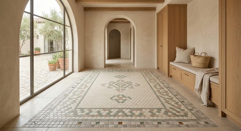
Step into a room with a carefully layered floor and the difference is immediate. The surface underfoot has texture, depth, and a kind of quiet complexity that a single-format installation rarely achieves. That layered quality is precisely what draws people toward eclectic mosaic work—and it's what makes the approach so rewarding when executed with care.
The industry has shifted its conversation considerably. Where uniformity once reigned unchallenged, the market now offers an expanding vocabulary of shapes, finishes, and materials. Homeowners and designers are embracing this range, moving beyond the default of one tile applied everywhere toward compositions that feel considered and personal.
Yet this freedom comes with a caveat. Variety without discipline produces disorder. A floor carries enormous visual weight in any room—it must feel intentional. The guidelines below explain how to achieve that.
Why Mixing Produces Better Results
Consider a room where one tile format covers every inch from wall to wall. The experience is seamless. It is also monotonous—the eye registers the pattern within seconds and stops looking for anything new.
Introduce a second format and the surface wakes up. When hexagons share space with rectangles, or when matte meets polished, the floor develops what designers call visual rhythm. It has movement and texture that keep the eye traveling.
This isn't limited to aesthetics. In open-plan settings, a shift in tile format communicates a change in room function. The kitchen area might use a patterned field while the adjoining living space transitions to something calmer. These subtle signals replace the need for physical dividers and give the home a sense of considered architecture.
Rule 1: Constrain the Palette from the Start
Before reaching for any sample board, make a binding decision about color. Two or three tones are sufficient for even the most ambitious compositions.
Warm neutrals—cream, soft taupe, gentle gray—provide the most forgiving canvas. They absorb variation in shape, texture, and material without introducing visual friction. Bolder accent colors gain clarity when layered against this restrained backdrop.
What this rule actually does is let shape and material generate the variety while color holds steady. Muted earth tones blend naturally with pieces carrying more personality. Warm grays serve as particularly effective mediators between assertive tiles and quieter ones.
This discipline doesn't limit creativity—it enables it. When color steps back, every other choice can move forward with greater confidence.
Rule 2: Assign Clear Responsibilities
A floor where every element demands equal attention becomes visually overwhelming. Success depends on hierarchy.
One tile anchors the composition—dominant in area, neutral in character, restrained in detail. A secondary tile carries more personality through pattern, texture, or a smaller format. The accent tile, occupying the smallest area, delivers a concentrated moment of visual energy.
The 60-30-10 guideline translates directly to flooring: sixty percent base, thirty percent secondary, ten percent accent. This distribution prevents any single element from overpowering the rest while maintaining genuine variety.
Tiles in chalky whites, softly glazed clays, or muted earth shades make ideal base layers. Their quiet presence ensures that every element layered above them reads clearly.
Rule 3: Combine Geometries That Work Together
This is where the process becomes genuinely creative. Squares, hexagons, rectangles, diamonds, triangles—each geometry introduces a distinct visual frequency to the composition.
A combination with lasting appeal: hexagons as the dominant field, framed by a border of square tiles. The geometric contrast establishes a natural perimeter, much like a rug defines a seating area on hardwood.
Keeping color constant while varying shape is another approach with broad applicability. Two tile designs in the same tone but different forms allow the grout lines to create the pattern organically. The effect is subtle and adaptable across styles.
Visit a ceramic tile shop and test these pairings physically. Laying a hexagon next to a rectangle under actual room light reveals details that photographs miss—the way edges meet, how grout lines redirect, the interplay of shadow at each junction. Mosaic floor tiles gain additional character precisely at these contact points, where one geometry yields to another.
You can also mix organic curves with angular forms to prevent a design from reading as overly rigid. That small tension between soft and sharp keeps the surface visually alive.
Rule 4: Adjust Scale for Balance and Focus
Proportion shapes perception quietly but decisively. Large-format tiles convey openness and calm. Smaller formats—mosaics, penny rounds, compact hexagons—create concentrated points of visual density.
Combining both within a single floor generates controlled contrast. Use large tiles to establish the dominant field, then deploy smaller elements as focal anchors at key locations—a threshold, an island, a transition between zones.
Two practical rules keep scale mixing coherent. First, change one attribute at a time: varying sizes should pair with consistent finishes, while mixing finishes should accompany uniform formats. Second, consider how the floor relates to the walls—a detailed floor benefits from simpler wall surfaces, and vice versa.
The most reliable way to judge scale is in person. A ceramic tile shop with multiple format displays allows side-by-side comparison at actual size. What looks balanced on a screen may feel disproportionate when placed on the ground.
Rule 5: Blend Materials Around a Unifying Thread
The most memorable tiled spaces draw from more than one material family. Ceramic, stone, glass, and porcelain each bring distinct qualities—weight, warmth, reflectivity, grain—and combining them creates richness no single material can achieve.
Glass accents embedded in a porcelain field introduce luminosity and chromatic depth. Concrete-effect surfaces paired with brick-look pieces generate understated warmth. Natural stone set beside wood-look porcelain bridges organic texture with contemporary precision.
The essential requirement is a connecting element. Color, finish, sheen, undertone—something must bind these diverse materials into a coherent family. Without that thread, the composition feels accidental.
Mosaic floor tiles sourced across material categories benefit most from this shared foundation. A terracotta wall piece finds kinship with a limestone floor through matching warmth. A fishscale detail in a shower niche reflects undertones present in the broader palette. The connection may be subtle—a shared matte surface or a parallel warm cast—but it holds everything together.
Well-curated displays at a ceramic tile shop often organize products by these invisible relationships—undertone families, finish categories, textural kinships. Learning to spot those patterns transforms how you evaluate compatibility.
Rule 6: Build Borders That Serve the Design
Borders accomplish more than decoration. They organize complex compositions and streamline installation simultaneously.
A defined perimeter border around a busy field pattern gives the eye a place to rest. It contains the visual activity, establishes completeness, and frames the room's edges with clean definition.
Transitional strips between different-format areas perform similar work at a smaller scale. A single course of brick-format tile between two larger fields marks a shift in rhythm without any jarring break. In open-plan homes, these transitions define spaces without physical walls.
Borders also reduce the complexity of cutting along the room's perimeter. The cleaner edges they produce reinforce the aesthetic benefit with improved craftsmanship.
Rule 7: Isolate Pattern and Surround It with Quiet
Ornament and restraint need each other. A room saturated with pattern becomes exhausting. A room without any becomes forgettable.
Reserve your most decorative work for a defined zone—a feature wall, a floor inset, a shower alcove. Let that section carry the complexity while everything around it remains calm.
A bold backsplash mosaic gains authority when the floor beneath it uses large, solid-color tiles. The plain ground amplifies the pattern rather than competing with it. At floor level, the same principle applies: a detailed inset framed by broad, plain formats reads as a deliberate centerpiece.
When patterned elements are concentrated and bordered, they become landmarks within the room. The surrounding calm ensures they register as intentional choices. Scattered across the entire surface, the same pattern loses its impact entirely.
Practical Considerations
Several decisions made before installation begins will shape the floor's lasting character.
Grout color and joint width influence the finished appearance more than most people expect. Dark grout sharpens every edge and intersection. Tone-matched grout softens the visual grid and lets the tiles themselves dominate the reading.
Always test physical samples in the actual space. Showroom lighting conditions rarely replicate a home's environment. Lay samples side by side, observe them across different hours, and give yourself several days before deciding.
Have your installer plan the complete layout before any tile is cut. Grout-line alignment between different formats is among the most consequential details in the project. Consult a ceramic tile shop for installer recommendations—experience with varied formats translates directly into cleaner results.
Match ambition to room size. Generous spaces absorb bold, large-scale patterns with ease. Tighter rooms benefit from restraint—a single accent section or a carefully placed detail band delivers more impact than complexity spread across every surface.
Conclusion
An eclectic mosaic floor is the product of decisions that speak to each other in a continuous conversation. Color supports shape. Scale mediates texture. Borders impose structure. Calm surfaces protect patterned ones.
Narrow the palette. Define roles. Combine geometries deliberately. Balance scale across surfaces. Connect materials through shared qualities. Frame busy zones with borders. Let quiet areas support decorative elements.
When every principle holds, the floor merges with the architecture as though it were part of the original design. It earns its place through coherence rather than spectacle—and that quiet certainty is the hallmark of a space shaped with genuine care.

 English
 Arabic
 French
 Spanish
 Portuguese
 Deutsch
 Turkish
 Dutch
Dutch
 Italiano
 Romaian
 Portuguese (Brazil)
 Greek
Greek