


The Small Purchase That Silently Elevates Your Entire Website
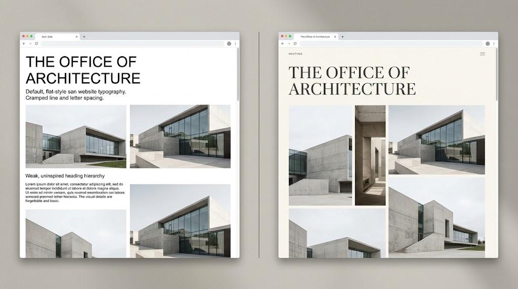
Starting a website project with limited resources does not mean accepting a limited result. Many successful businesses today operate on lean budgets while still presenting an online presence that commands respect.
The difference between an adequate site and one that feels genuinely premium often comes down to a single, frequently overlooked element. Most people concentrate on layout and features while neglecting the visual component that visitors notice first and most consistently.
That component is typography. A strategic investment in one quality typeface can reshape the entire experience of your site without requiring any structural changes.
The Default Font Reality
Most budget websites are visually indistinguishable from one another, and the explanation is straightforward. They draw from the same small pool of free, pre-installed typefaces.
Arial, Roboto, Helvetica, and Open Sans appear on countless pages across the internet because they require no purchase, no upload, and no customization whatsoever.
They perform their function adequately. Cross-platform consistency is strong and readability is generally acceptable. Nothing about these typefaces is broken or unusable.
The difficulty is that their very familiarity makes them invisible. A visitor who has navigated several websites already that day carries no memory of yours because nothing about the text stood apart.
If you engage a cheap website designer, this is almost certainly what you will receive. They use whatever the builder provides to minimize effort and avoid complications. Custom typefaces involve licensing purchases, file preparation, and CSS rules that exceed the boundaries of a typical budget scope.
Your brand then adopts the visual anonymity of every other page built on the same platform with the same free fonts.
The Design Philosophy Behind Luxury Websites
Pay close attention to how premium brands construct their websites. What you will find is simplicity, not complexity.
Layouts are lean. Copy is carefully edited to the essentials. Navigation is clear and uncluttered. There is no visual noise creating competition for the visitor's focus.
Two elements carry these brands' visual identity: high-quality imagery and distinctive typography. Together, they establish a sense of quality before any product or service is discussed.
If your budget does not accommodate professional photography, stock images become your visual backbone. This places an outsized responsibility on your typeface, since the text becomes the element visitors interact with most extensively.
The cognitive and emotional response to typography occurs almost instantly. Before any content is processed, the shapes and spacing of your letters trigger associations that frame how the entire site is interpreted.
A typeface with genuine character does more than alter a cosmetic feature. It redefines the lens through which visitors assess your brand's quality and professionalism.
The Single Purchase That Transforms Everything
You do not need a font subscription or a large collection of typefaces. A single quality display typeface is sufficient to dramatically change your site's visual personality.
Display typefaces are built for prominent text elements: hero sections, main headings, and any content designed to capture immediate attention. Browse catalogs at Fontspring or MyFonts to find options that align with your brand's tone.
Evaluate candidates based on the character of their letterforms. Look for distinctive proportions, interesting curves, or unique structural details that separate the typeface from generic options.
A commercial license for the weights you require typically costs between 30and30and50. That single file creates a visual signature that distinguishes your site from the overwhelming majority of template-built pages.
The moment your display font is applied, the transformation is clear. Your headings carry an authority and personality that no free typeface can replicate.
Pairing Your Typefaces for Maximum Impact
Keep your premium display font out of body paragraphs. These typefaces are engineered for visual impact at large sizes. At small sizes, the details that define their quality dissolve into illegibility.
For body copy, use a free sans-serif designed for screen readability. Inter is an excellent choice. System UI provides a dependable browser-native alternative.
The contrast between a distinctive heading font and a neutral body font generates the impression of expense. One captures the eye with confidence. The other delivers content smoothly without causing visual fatigue.
Hold your system to two typefaces. A third or fourth font disrupts the visual cohesion and makes the page feel disorganized. Restraint in font selection reflects a professional sensibility.
Spacing Makes or Breaks the Result
Choosing the right typeface is important, but insufficient. The space around and between your letters determines whether the typography reads as refined or carelessly assembled.
Body text requires a line height of roughly 1.5 to 1.6. This provides clear separation between lines while maintaining a natural reading rhythm. Tighter leading creates a compressed feeling that discourages continued engagement.
Headings benefit from thoughtful attention to letter spacing. A small increase in tracking often enhances their visual quality noticeably, adding a quiet layer of sophistication.
The size contrast between headings and body text needs to be pronounced. A header that barely exceeds paragraph size looks hesitant and unsure. Premium design is assertive. Make your headings unambiguously large.
A Restrained Color Approach
Polished, high-quality websites tend to use very limited color palettes. Near-monochrome schemes are prevalent among premium designs because they keep the focus on typography.
Dark charcoal text on an off-white background feels refined and comfortable during extended reading. Pure black on pure white creates a harsh contrast that fatigues the eyes over time.
Buttons and links need to be clearly functional. They do not need to be visually dominant. A single, muted accent color provides sufficient guidance for user interaction.
When your typeface has real character, color assumes a secondary role. The letterforms themselves command the visitor's attention, making elaborate palettes unnecessary and even distracting.
Delivering Your Font with Precision
Purchasing the typeface is only the beginning. How you deliver it to each visitor determines whether the experience aligns with your design goals.
Self-host your font files on your own server. This eliminates a third-party dependency from the critical loading path and gives you full control over timing and reliability.
Font purchases arrive with files in .woff and .woff2 formats. Place them in your server directory and declare them using a standard @font-face rule in your CSS.
A page that renders custom typography without any delay communicates professionalism and technical competence. A page that briefly displays unstyled text before the font arrives conveys the opposite. Rendering performance and perceived quality are directly linked.
Building Resilience into Your Typography
Font files are not immune to failure. Network problems, server timeouts, and file corruption are all realistic scenarios that your design should address proactively.
Set a fallback typeface that matches the general classification of your primary font. A geometric sans-serif should default to Arial or Helvetica. A serif should default to Georgia.
This ensures that even when the custom file does not load, visitors encounter a clean and readable layout. The character shifts slightly, but the overall professionalism remains intact.
Test this regularly by blocking the font file through your browser's developer tools. Reload the page and confirm that the fallback maintains a composed, intentional appearance.
Shaping the Visual Outcome from the Client Side
Even when someone else handles the technical build, you have meaningful influence over how the site looks. That influence requires you to act early and communicate clearly.
When you explore affordable web design options, expect the scope to be lean. Template-driven builds typically depend on whatever the platform provides out of the box, including typefaces.
Purchasing a font license yourself changes the equation entirely. Provide the files to your developer and ask them to implement the typeface across all headings with a suitable companion for body paragraphs.
Most builders respond well to this kind of specific direction. It streamlines the process and raises what can be accomplished within a constrained budget. Your small investment elevates the entire project's visual quality.
The Millisecond Assessment Every Visitor Makes
Visitors form a judgment about your site before reading a single word. The visual texture of the text is a major factor in this rapid, largely unconscious categorization.
Typefaces that appear across thousands of pages trigger assumptions of anonymity. Typefaces that feel distinctive and intentional trigger assumptions of quality, care, and credibility.
This response has been shaped by years of browsing behavior. We associate custom typography with brands that take their visual presentation seriously because historically, that association held true.
That connection now benefits anyone willing to make a modest, targeted investment. One typeface choice can place your site alongside brands with vastly larger budgets. The underlying psychology remains as strong as ever.
In Summary
A professional aesthetic on a constrained budget is entirely within reach. It depends on knowing which design decisions create the greatest visual impact for the least cost.
Typography stands as the single most efficient investment in web design. One quality typeface can conceal the simplicity of a basic layout, compensate for the anonymity of stock images, and give your brand a visual voice that is distinctly its own.
When you research affordable web design for your next project, build the cost of one quality display typeface into your initial plan. It is a small addition with a transformative effect.
Leave the platform defaults behind. Select a typeface with intention, pair it with a clean body face, and implement it with care. The difference visitors notice will be immediate and unmistakable.

 English
 Arabic
 French
 Spanish
 Portuguese
 Deutsch
 Turkish
 Dutch
Dutch
 Italiano
 Russian
 Romaian
 Portuguese (Brazil)